
A small event usually needs three messages before it needs more decoration: where to go, what to do on arrival, and where to ask for help. Draft those messages first, then use Canva to arrange them. AI can suggest shorter wording; the organiser must supply the real room names, times and instructions.
Canva's current homepage lists Magic Write and several design formats. That supports trying a writing-and-layout exercise, not a promise that AI will produce accurate signs automatically. This guide is an original practice plan, not a recorded Canva test. Canva product information
Contents — jump to a section
Prepare a sign brief
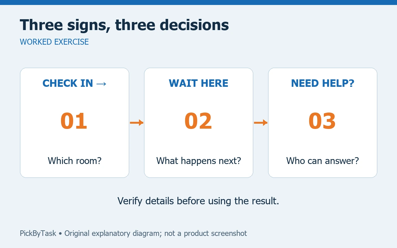
Use a fictional repair event for the first version: check-in at Room A, waiting at Room B, and questions at the welcome desk. Assign one person to confirm the route before printing. Do not ask AI to invent accessibility facilities, emergency exits or venue rules.
Make a three-row sheet with the sign's location, its one instruction, and the person who can confirm it. “Check in at Room A” is an instruction. “Welcome to a seamless experience” is not. Set an estimated 30–45 minutes for the first text-and-layout draft; that is a planning allowance, not a measured product speed.
Draft the wording before the layout
Try this prompt in an available writing assistant, or answer it yourself:
Rewrite these three event instructions as short signs.
1. Visitors must register at the desk outside Room A.
2. Visitors waiting for repair assessment should go to Room B.
3. Questions go to the welcome desk.
Keep room names unchanged. Produce a heading and one short sentence
per sign. Do not add times, guarantees, facilities or directions.
An acceptable first card could read “CHECK IN — Register outside Room A.” A generated “Repairs while you wait” would introduce a service promise absent from the brief. Remove it even if it makes the design sound friendlier.
Build and check three cards
- Choose one page size suitable for the intended display. Keep the same size across this set.
- Place the action first, the location second and optional decoration last. Leave enough empty space around the text.
- Use one consistent heading style. Avoid giving a sponsor name more visual weight than the direction.
- Ask a person unfamiliar with the event to read each sign at the intended viewing distance and describe the next action.
- Review the exported or printed result, not just the zoomed-in editor. If a line is hard to read, shorten it or enlarge it before adding another effect.
For the waiting sign, check whether “Wait in Room B” is enough. If visitors must first receive a ticket, the sign needs that real instruction too. A short sign that skips a necessary step is still a bad sign.
When the result needs another pass
If a reader goes to the wrong room, check the wording and placement separately. Put a temporary paper sign in the actual location to test the route. If the venue changes a room assignment, update all three cards from the brief rather than editing one exported file and forgetting the others.
Use your own artwork or assets whose permissions fit the intended use. Before choosing a paid plan, inspect the current account allowance, chosen assets and export options. This exercise does not require a particular subscription or assert that every feature is free. A plain document editor and a printed page are a workable fallback.
Finish with a real visitor check
The set is ready when a new visitor can identify check-in, waiting and help without guessing, the venue confirms the details, and all three exports match the same brief. Keep the editable version with the event notes so a late change can be corrected quickly. For a wider design comparison, use our image and design guide.
Product scope checked on 2026-09-14: the linked Canva page lists the writing tool and design formats. Account entitlements, printing results and the proposed event exercise were not tested. Before selecting a plan, consult the current plan page for the allowances relevant to your account.